A Call to Action (CTA) serves as the tipping point between bounce and conversion in the world of marketing. It's the point within your content or campaign where you encourage your audience to take a step—the step that turns passive readers into active participants, leads into customers, and browsers into buyers.
Learning how to write a CTA that is effective is an art that blends psychology and clarity to create a sense of urgency and need in your target audience.
As a marketer or business owner, understanding how to craft a powerful CTA is essential. Your CTAs guide users towards your business goals, whether that's signing up for a newsletter, downloading a whitepaper, or making a purchase.
To write a CTA that is effective, it's crucial to use direct language that resonates with your audience while also standing out visually on your page.
A good CTA button or link is noticeable, provoking, and succinct, making the user feel like they're on the verge of accessing something desirable and exclusive.
Finally, the placement of your CTA can significantly influence its effectiveness. It's not just about what you say, but also where you say it.
Strategic positioning on your webpage, within an email, or at the end of a blog post ensures that your call to action is aligned with the user's journey.
It should feel like a natural next step, leading them to what they should do next without confusion or distraction.
With the right CTA, your marketing campaigns and business strategies can achieve better results and higher engagement.
Understanding the Importance of a Call to Action
A Call to Action (CTA) is crucial for guiding your audience towards making a desired conversion in your marketing campaign. Mastering CTAs can significantly enhance user engagement and lead generation.
What Is a Call to Action?
A Call to Action is a prompt on a website that tells the user to take some specified action, such as “Sign Up,” “Buy Now,” or “Learn More.” It's a direct instruction that guides your audience to the next step you want them to take, playing a pivotal role in transitioning users from passive viewers to active participants and leads in your marketing funnel.
Benefits of Good Calls to Action
- Higher Conversion Rates: Learning how to write a CTA that is well-crafted increases the likelihood of user action, contributing to higher conversion rates. They create clear pathways for users to follow, reducing confusion and decision fatigue.
- Enhanced User Engagement: By providing concise and compelling CTAs, you facilitate smoother navigation, encouraging deeper interaction with your content and website.
- Lead Generation:
- Visibility: CTAs that stand out are more effective at capturing attention and driving action.
- Relevance: Tailoring CTAs to specific audience segments ensures greater personal relevance and response.
- Streamlined Marketing Campaigns:
- Alignment: CTAs should align with campaign goals to solidify the connection between the user's action and your objectives.
- Feedback Loop: They serve as tools for measuring the effectiveness of campaign elements, allowing for data-driven optimizations.
How To Write a CTA
Crafting an effective call to action (CTA) is essential to guide your audience towards the outcome you desire, whether it's subscribing to a newsletter, joining a campaign, or purchasing a product. The right CTA buttons not only stand out on a page but also align with the specific goals of your ads and landing pages.
Best Practices for Creating Effective CTAs
The most successful CTAs are built on practices that consider design, language, and placement.
Your CTA buttons should be specific, and persuasive, and use language that conveys value. Ensure your CTA's message is tailored to your campaign's goals.
Make It Concise and Clear
Your CTA should be clear and concise. Phrases like “Subscribe Now to Get Your Free Guide” are direct and inform users of the benefits they'll receive, making the decision to click easier.
Make It Visible
Visibility is vital. Place CTAs where users naturally look on your website or landing page. They should be large enough to notice without overwhelming your content.
Use White Space
Strategically use white space around your CTA button to draw attention and minimize distractions. This design principle helps the CTA to “breathe” and stand out.
Use Contrasting or Bold Colours
Select colours that contrast with your website’s palette to make your CTA pop. Bold colours grab attention and can influence users to take action.
Match CTA to Device Type
Your CTAs must be responsive, and fit well on various devices. Mobile users, for instance, prefer buttons that are easy to tap with a thumb.
Have Well-Considered Page Placement
Proper placement on a webpage is crucial. Above the fold is traditional, but placing CTAs after informative sections can also be effective as users understand the value.
Write Benefit-Forward Supporting Text
Copywriting surrounding your CTA should highlight the benefits of the offered product or service. Emphasize the value the user will gain to encourage clicks.
Create Thoughtful Copywriting
Invest time in copywriting that resonates with your audience. Use language that's persuasive yet genuine to reflect the message you wish to convey with your CTA.
Continual Optimization Through Testing
To consistently elevate your conversion rates, it's essential to embrace a culture of continuous optimization. This approach relies on rigorous testing to enhance the effectiveness of your calls to action (CTAs).
Test, Test, and Test Again
Testing is the cornerstone of improving your CTAs. By implementing regular A/B tests, you can make data-driven decisions that incrementally increase conversions over time. Here's how to go about it:
- Start with a Hypothesis: Define what you're testing and why. This could be the colour of your CTA button, the wording used, or even its placement on the page.
- Create Variations: For a valid A/B test, you need two versions: the control (A) and the variation (B). Make sure only one element differs between them to accurately measure impact.
- Measure the Results: Utilize analytics tools to compare conversion rates between the two versions. Your goal is to identify which variation performs better.
- Implement Findings: Once a clear winner emerges, apply that change to your CTA.
- Repeat: Testing is an iterative process. Even if you see an improvement, there's always room to enhance your conversion rates further. Keep testing different elements.
Drawing It All Together
In crafting a call-to-action (CTA), the essence lies in carefully honed messaging that drives your audience toward conversion. This portion of your marketing strategy acts as the climax, summarizing key points and directly influencing the success of your efforts.
15 Great CTA Examples And Why They Work
1. ConvertKit
ConvertKit is a platform that has helped creators connect with their audience and make a good living out of creating content. The secret to their success? They provide creators with a clear path towards achieving success.
Case in point: this CTA.
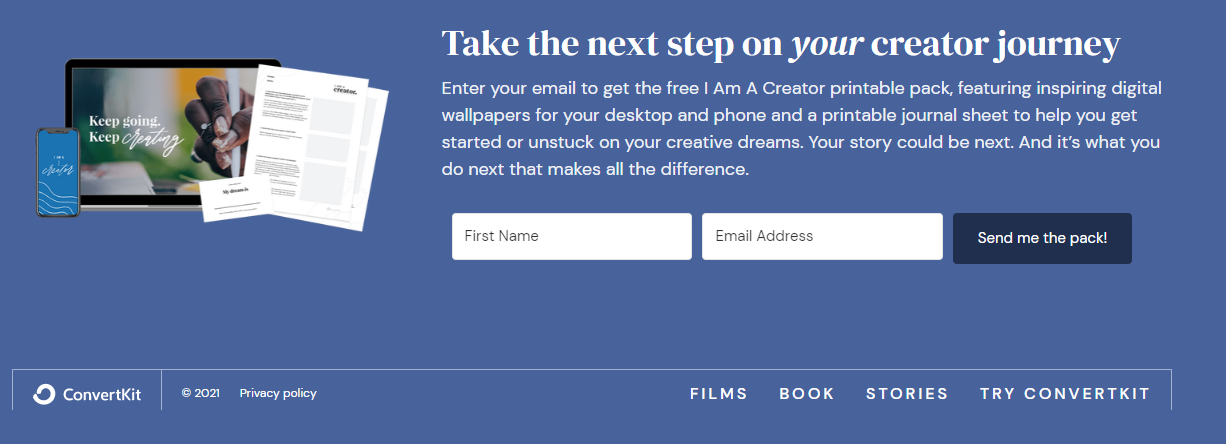
Why the CTA works
The CTA works because every element in the copy builds up to a relevant and emotionally charged CTA. The headline is easy to see and communicates a big benefit. Moreover, the rest of the copy expands on the promise of the headline. It also helps that it explains clearly how the offer will fulfil the promise made in the headline.
2. Hubspot
Hubspot has been a household name among marketing and sales professionals for years, and for good reason. Having one of the best CRM platforms in the market helps. Most of all, they know how to sell their product with a compelling CTA, as shown below.
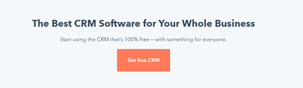
Why the CTA works
This CTA (“Get free CRM”) is effective because it emphasizes that the prospect is getting real value… for free. The entire layout is set up in a way that moves the reader's eye logically from the headline to the subheadline to the CTA. The stark contrast between the white space and the primary orange colour makes the CTA copy hard to miss.
3. Whereby
Whereby's value proposition is to “make video meetings easy for you and your business.” And true to form, they made it easy for prospects to sign up for the service with an effective CTA.

Why the CTA works
When you have a powerful headline and video working together to speak to your prospects' struggles and offer a promising solution, your prospect won't need much convincing to try your service for free. The CTA gives shape to the overall intent by making it clear to prospects that the service is free, making the offer even more appealing.
5. Julia McCoy's Newsletter
I'm a big fan of Julia McCoy's newsletter. The Express Writers founder offers free tips and resources to help creators, marketers, and entrepreneurs become more successful. Better yet, she offers paid courses and workshops to help them step up their game even more.
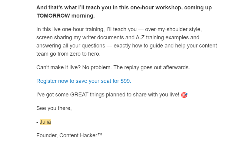
Why the CTA works
First off, THAT is how you sell a one-hour workshop in a newsletter. If the value proposition (“bring a writer up from zero to hero”) doesn't leave freelance writers chomping at the bit, the sense of urgency expressed (coming up TOMORROW morning”) in the rest of the copy will. This, of course, sets up an effective CTA. Why is it effective? First off, it makes the next step clear to the reader. Better yet, it conveys a sense of exclusivity, making the offer more desirable to prospects.
6. Freshbooks
Freshbooks is a cloud-based accounting solution tailored for freelancers and small business owners. It streamlines financial management and simplifies an otherwise complicated and painful process. And the company knows how to sell that advantage with their CTAs, as shown below.
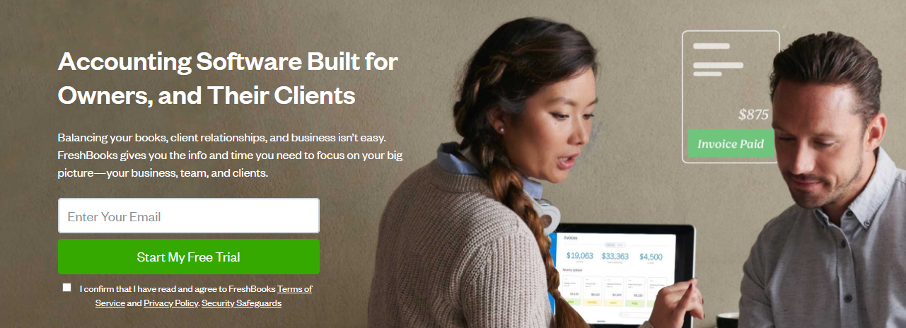
Why the CTA works
Sometimes, the best way to craft a compelling CTA is to make the web copy and design elements do most of the work. The big headline works because it communicates clearly who the solution is for. The secondary headline then speaks to the needs of the target audience and lays out exactly how the solution will benefit them. The CTA then puts the finishing touches by putting the ball in the audience’s court.
7. The altMBA
The altMBA is a 4-week digital leadership workshop designed by the Yoda of marketing himself, Seth Godin. The website’s homepage shows a playback video showing testimonials from some of the workshop's alumni. It also comes with a CTA that invites visitors to sign up for the mailing list.
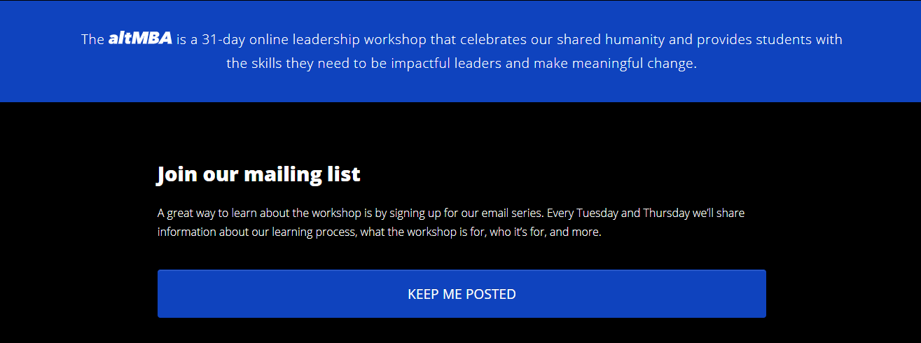
Why the CTA works
As you can see, the CTA copy is not asking visitors to sign up for the workshop yet. It only asks them to join a mailing list. This is a good call. For one, the tuition is quite hefty. Second, not all applicants will be accepted. At this stage, visitors need more information before they are persuaded to join. For now, prospects are curious and excited and will want to know more. The CTA copy “Keep Me Posted” is simple, but the fact that it’s relevant to the current needs of the prospect makes it effective.
8. Asana
Asana is one of the most popular project management tools out there. If you've been keeping up with the project management tool wars, you know that Trello is one of their fiercest competitors. To steal some of Trello's customers, they created the following comparison page.
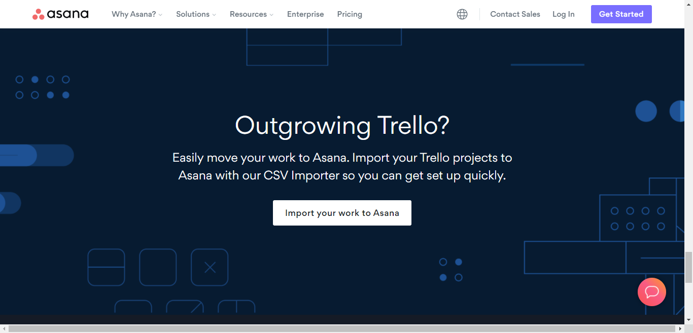
Why the CTA works
Asana went right for the jugular by using a question headline that dares disillusioned Trello users to confront a pain point they've been struggling with. The secondary headline then explains in simple, concise words why they should switch to Asana. It’s a good segue to the action-oriented and very specific CTA text (“Import your work to Asana”), don’t you think?
9. Mailchimp
Mailchimp prides itself as an all-in-one marketing platform. Being marketed as such, however, comes with its share of challenges. When your solution does just about everything, prospects might feel wary about making drastic changes.
With that said, Mailchimp does a great job of communicating why prospects should make the switch via its homepage and in particular its CTA.
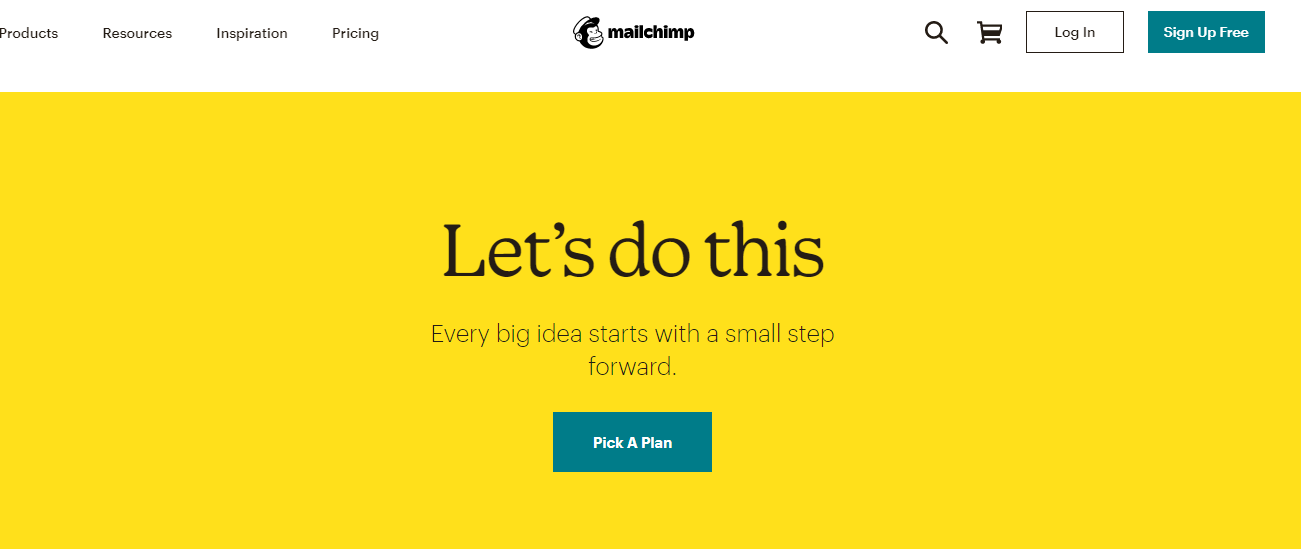
Why the CTA works
You see the above image once you’ve reached the bottom of the homepage after a long scroll. I love the headline and the secondary headline because they create tension and imply big changes coming ahead. The CTA text is simple yet perfect in this context because it tells the prospects the next step they need to take.
10. Canva
Canva is a design tool that does everything, including helping you create resumes that will knock people’s socks off. The design company makes sure you know it via the following page:
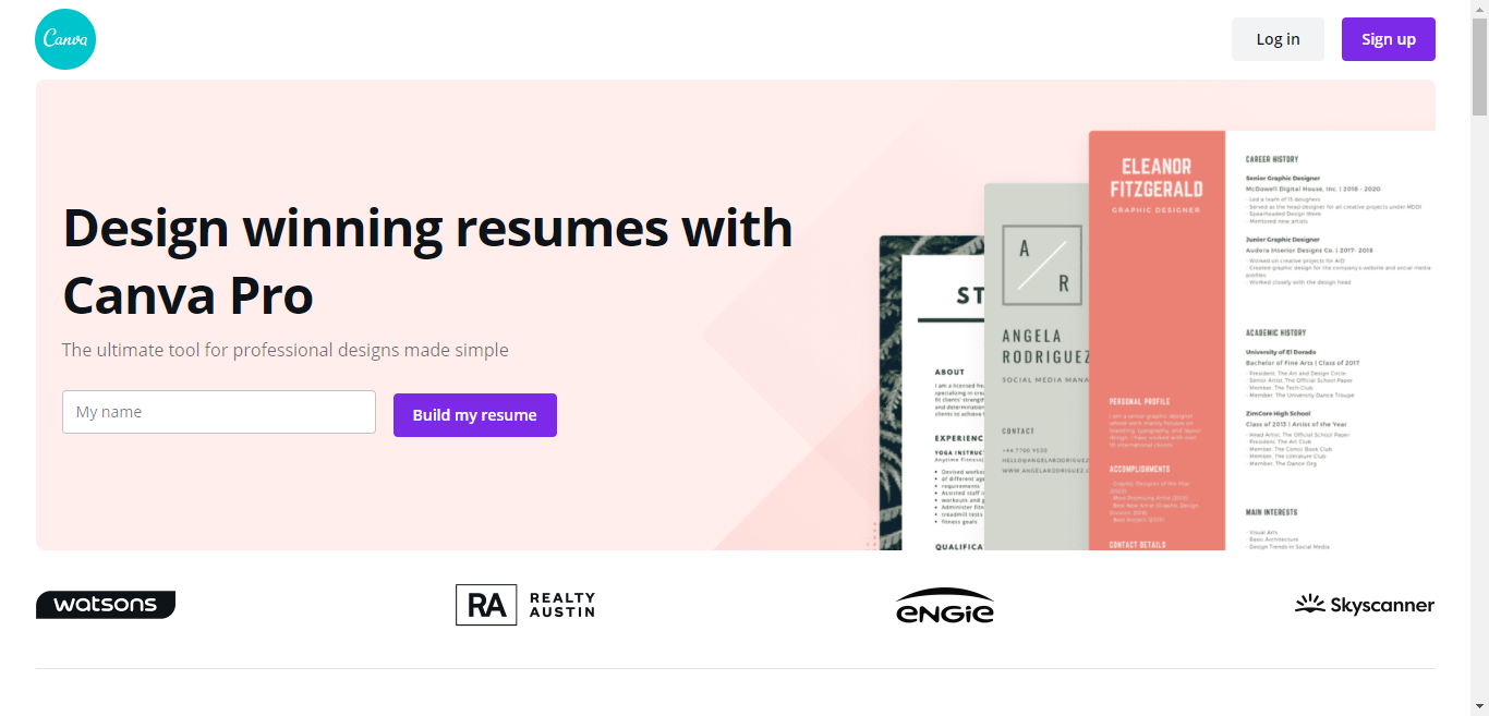
Why the CTA works
Canva does everything right with this landing page. Aside from communicating clearly their value proposition in both the headline and the secondary headline, they also presented a visual demonstrating why they are the best. The CTA is effective because it communicates clearly what will happen once a prospect clicks on the button.
CTA with a sprinkling of social proof (“Join 25,000 subscribers”). Also, joining the actual course is quite an investment, so offering the newsletter at this stage is a good call. There's enough in the entire homepage to spark curiosity and arouse desire. Adding a CTA that mirrors what the audience is thinking gives the entire pitch the push it needs to convince prospects to subscribe to the newsletter.
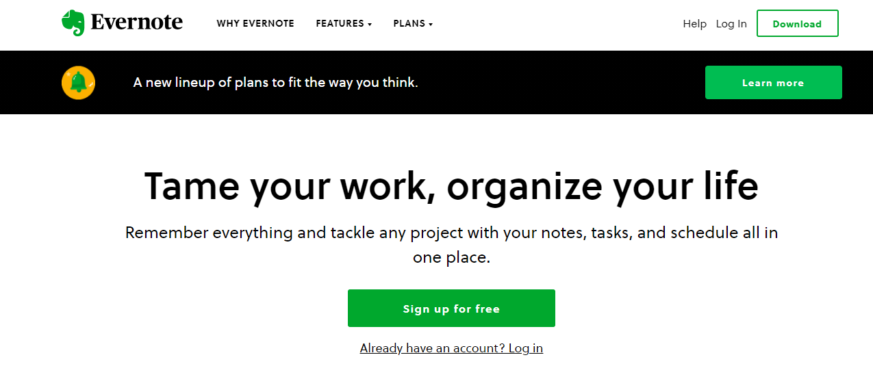
15. Evernote
“Tame your work, organize your life.” That headline alone makes it clear to prospects what Evernote is all about. Better yet, the rest of the copy as well as its design elements communicate effectively how the note-taking app can make their lives easier.
Conclusion
Your CTA should encapsulate the core message of your marketing content, urging the reader to take the next step. To ensure effectiveness, employ:
- Imperative verbs: Start your CTA with words like buy, download, click, or subscribe to give clear direction.
- Urgency: Phrases like limited time offer or while supplies last compel immediate responses.
- Benefits: Explicitly state what's in it for the user, such as Get your free ebook or Join now and save.
- Contrast and Visibility: Use design elements like colour and size to make your CTA stand out on the page.
- A/B Testing: Regularly test different variations to optimize conversion rates.
Answering Your Questions
When learning how to write a CTA (call-to-action), it's normal to have questions that need answers. This part of the article is dedicated to addressing common inquiries you might have, providing clarification to foster a clearer understanding.
FAQ
What exactly is a CTA in marketing?
A CTA is a prompt on a website that tells the user to take some specified action, typically in the form of a button or link.
How do you write a CTA that is effective?
- Use strong, imperative verbs to encourage action (e.g., Buy, Download, Subscribe).
- Ensure your CTA conveys a sense of urgency or benefit (e.g., Get started today, Join free for a month).
What should be the size and colour of a CTA button?
- The button should be large enough to be noticeable but balanced with the overall design.
- Choose a contrasting colour that stands out from the page background but still complements the overall colour scheme.
Where should the CTA be placed on a page?
Place your CTA where it's highly visible without disrupting the user's natural browsing flow, such as near the top of your webpage or in the central part of a landing page.
How do you measure the effectiveness of a CTA?
Use analytics tools to track metrics like click-through rates (CTR), conversions, and bounce rates related to your CTA.
Can a page have multiple CTAs?
Yes, but each CTA should have a clear purpose, and multiple CTAs should not compete for attention. Prioritize them based on your business objectives.
Is it important to A/B test CTAs?
Absolutely. A/B testing allows you to compare different versions of your CTA to see which delivers better results, helping to refine your approach for maximum effectiveness.
Call to Action (CTA)
Now, it's your turn!
Share your thoughts, experiences, or questions about any tips or tricks you use when you write a CTA for your affiliate marketing business in the comments below.
Which strategy resonates most with you, and how do you plan to implement it?
If you found this guide valuable, share it with your network and fellow affiliates.
Let's create a community of empowered affiliate marketers driving success through cooperation!